.jpg)

This post is a follow up to my post ‘Econometrics in GSheets’. In this post I’ll be replicating the same process in a Google Colab notebook using Python, rather than using GSheets. If you’re not already familiar with Econometrics, I recommend you go back and read that post first.
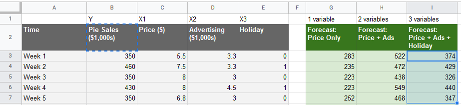
My previous post used native LINEST function to run a multivariate regression in Google Sheets. I adapted this method and took the data from this video by Jalayer Academy using a Google Sheets add-on package called XLMiner, which was broken by Google’s move to verify apps in December 2019.
In this post we’ll be using the exact same data, process and technique – we’ll even get the same results! We’re just replicating it in Python using a Google Colab notebook (a free, hosted version of a Jupyter Notebook). If you’re familiar with Python you’ll be able to take this code and run it wherever you need it. If you’re new to coding, Colab is probably the easiest way to learn – you can run each cell inline to see what it does.
To follow along, here is the Google Colab notebook for you to copy:
How can you do multivariate regression in Python?
Thankfully the scikit-learn (SKLearn) and Pandas libraries make this incredibly easy. Once you have your data in the right format it’s as easy as running this one line of code:
model.fit(X, y)
- model - this is the linear regression model we will initialize with SKLearn
- y - this is the variable you want to predict, in our case sales
- X - the variable(s) you think can predict y (price, advertising, holiday)
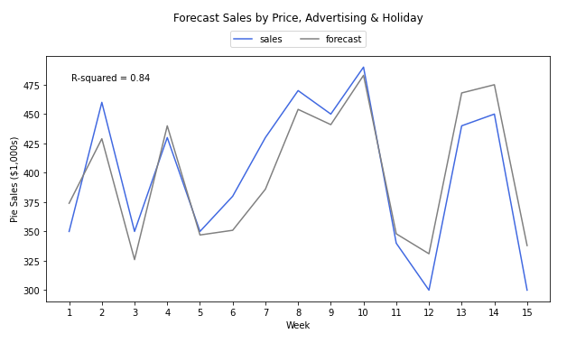
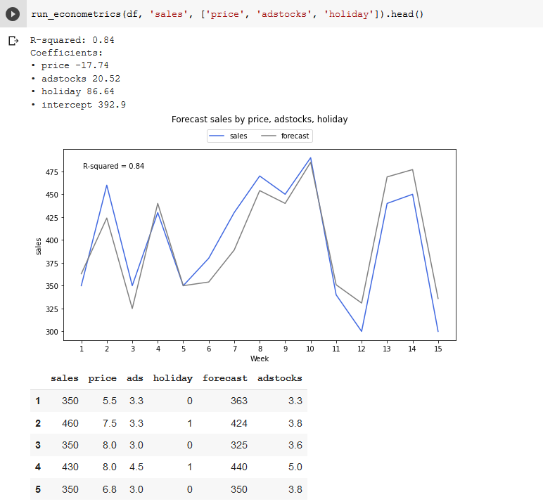
Then once your model has been fit, we can get the normal coefficients, R-squared value and make predictions, just as we did with Google Sheets – in fact, the numbers will match exactly. Then of course you can plot the forecast, which in our model looks like this:
Why should you do Econometrics in Python?
Python is harder to learn than Google Sheets, and less intuitive, especially for non-technical team members who might want to make changes to the model without using a developer or data scientist. So what are the benefits of using Python to build your Marketing Mix Model?
The main benefit is reusability – once you’ve written the script once, you can run it over and over again, and instantly get exactly the same results. As such code is inherently more reliable and scalable than relying on GSheets, which takes a lot of manual effort in formatting each time, and is more prone to human error. Code can also be productized, that means you can build an interface for non-technical users to run the model (hiding complexity from them, and limiting potential mistakes) as well as connecting it into other systems (like automatically making budget changes in your Google or Facebook ad accounts).
The other big benefit is flexibility. Libraries like scikit-learn have commoditized algorithms – without understanding any of the math or even making many changes to your code, you can import a different model like Naive Bayes, Random Forests or XGBoost, and see how it compares in accuracy. This opens up the possibility of using machine learning algorithms, as well as advanced techniques for improving accuracy, like cross validation.
Getting the data in the right format
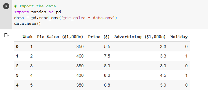
First you want to create your own Google Colab notebook, or make a copy of our model to follow along with your own data. You can find my data here, then download the GSheet as a CSV. The next step is to upload the file into Google Colab, which is in the left hand menu under files, click the upload icon (first one).
Now let’s see what we have – import Pandas (the closest thing Python has to Excel), load the CSV then display the head (first five rows).
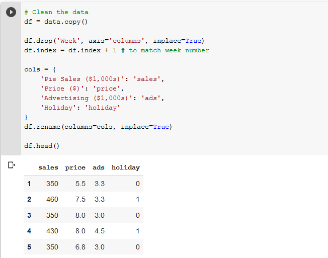
We’re going to do some cleaning of the data, just dropping the ‘Week’ column, renaming the other columns, and changing the index to match the week number (indexes start at 0 by default).
Great, we’re already at the fun part. Import the linear model from the SKLearn library, define your y (what you want to predict) and X variables (what think is predictive), fit the model and print out the R-squared score.
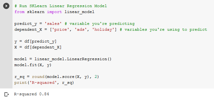
As you can see, SKLearn makes this trivially easy if you know a bit of Python. We simply initialize the model (that’s the `model = linear_model.LinearRegression()` line), and run `model.fit(X, y)`. Then the model is ready to give us the R-squared value, as well as other important information like the coefficients.
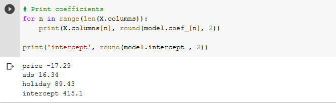
This cell block is simply printing out the coefficients one by one and labeling them with the column names we chose. Rather than using the coefficients to make predictions like we needed to do with GSheets and LINEST, we can actually just get the predictions directly from the model.
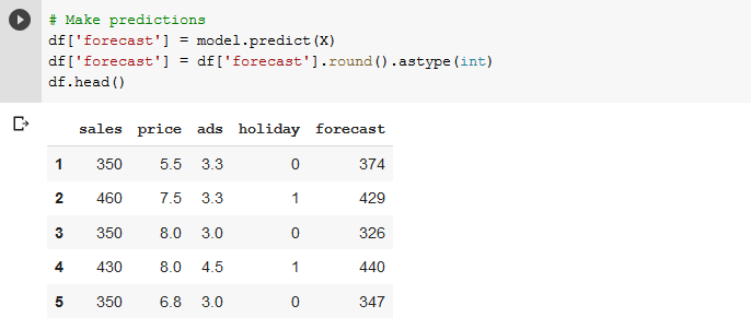
Here we assigned the predictions back to be a new column in the Pandas data frame as a ‘forecast’ column. Here we can eyeball how close it is to the actual sales data, as well as compare it to the data we had in our original GSheet model – you should see they’re the same!
Visualizing the Forecast Data
Creating the line chart isn’t quite as intuitive in Python as it is within GSheets – we have to use a fairly old library called MatPlotLib. However the benefit of doing this in code is that once you get the right formatting you can get the same results again and again without any further work.
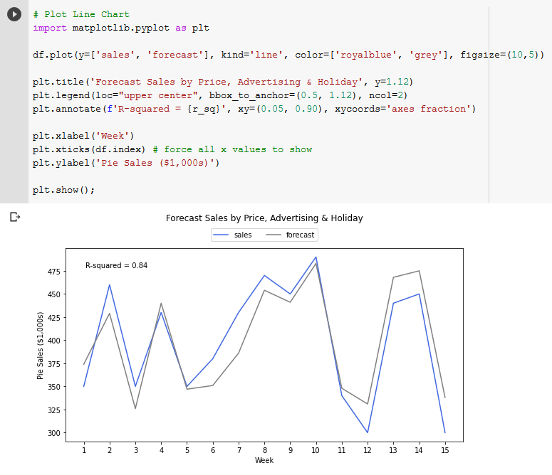
The above code uses MatPlotLib to plot a line chart of the sales and forecast data. We have full flexibility over the color of the lines, the size of the figure, as well as the titles, legend and axis labels. We also annotated the chart with the R squared, to see the accuracy at a glance.
Packaging up code for reuse
It was a pain to write all this code from scratch – I had to look up a lot of the functions I hadn’t used in a while, and it took far longer than creating the GSheet. Not to mention the 7 years of evenings and weekends I spent learning to code in the first place! However now we come to the big payoff. Unlike GSheets, we can package this code up in a function or library to use again and again. It just involves taking the same inputs, and generating the same outputs, using exactly the same code, just all put together in a function.
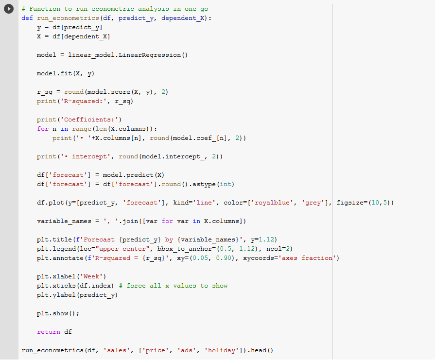
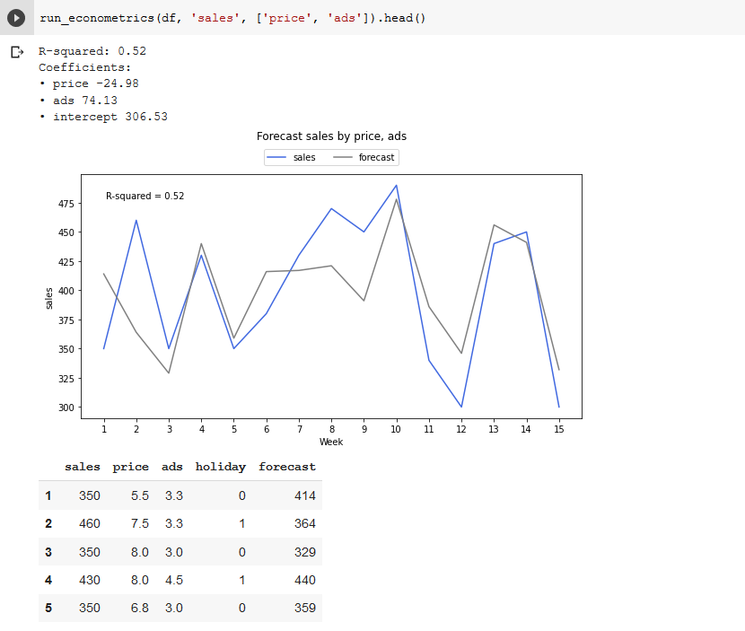
You’ll recognize all the various pieces, which all fit into this function rather than individual cells. This is one of the benefits of Jupyter Notebooks and Google Colab – you can run things line by line in cells to figure out how they work, then package them together in a function to use later. Now we have this function, running another regression with different variables is as easy as `run_econometrics(df, y, X)`. For example if we wanted to test the accuracy of just 2 variables.
At this stage we could make just a few modifications and run it on a server, offer it as an API, connect into our analytics account using an ETL, really it’s up to us how we use it. We could schedule it to run once a year, quarter, week, day or hour if we please. We can start testing new variables, engineering new features and testing to see if we can improve accuracy. Google Sheets is great to get started, but if you’re serious about Econometrics, you need code.
Measuring long-lasting effects with adstocks
Now we have a function for running this analysis with little effort, we can engineer new features and test them in the model with very little effort. For example in our GSheets model we transformed Advertising Spend into Adstocks, which let us measure carry-over effects from our advertising. We can do this in Python using a technique adapted from Sarbadal Pal.
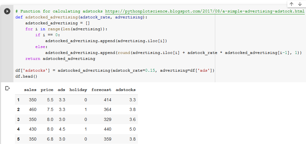
This method loops through the advertising values and calculates the adstocks, just as our GSheets formula did. Check and see that the values exactly match what we had in our GSheets model. Note that this function is not vectorized (meaning it might run slow on larger datasets), but it’s good enough for our purposes.
Because we packaged up our code, it’s simple to run the same regression analysis but with our newly engineered feature. This is quite a simple model, but you can imagine if you’re doing this type of market mix modeling with huge datasets and thousands of variables, learning how to do this in Python really pays off in time saved.
---
That covers how to do Econometrics in Python, using Google Colab and the Pandas + Scikit-Learn + MatPlotLib libraries. To see this same process but in GSheets instead of Python (and learn a bit more about Econometrics), visit the previous post in this series or keep reading the next post to learn about Diminishing Returns:
- Econometrics in GSheets
- Econometrics in Python (this post)
- Diminishing Returns
- Measuring the Halo Effect
- When Econometrics Works
In future we plan to cover:
- Word of Mouth Coefficient
- Testing Model Accuracy
- Monte-Carlo Simulations
- Machine Learning Models
- Data Import from APIs
- The Future of Econometrics
- Any other topics? Tweet @hammer_mt to request

